18

Super User offers free advertising under certain conditions.
Let's leverage that, in 3 phases:

  1. Run a contest below to design the best ad.
  2. On June 6th, the best-voted answer will be posted to Super User.
  3. Upvote that answer so that it reaches the threshold to get displayed.

Now is PHASE 1: Post your ads below!

2
  • 8
    Our biggest problem right now is the lack of good answers (we're near the bottom of the site list when it comes to questions having an upvoted answer). So ads should be geared towards recruiting answerers rather than askers. Commented May 26, 2014 at 16:21
  • @Gilles: Interesting tip. Feel free to design ads that will appeal to answerers. I think that for now the important thing is to get people to know that this site exists... we can handle 10 times more questions.
    – Nicolas Raoul Mod
    Commented May 26, 2014 at 16:58

7 Answers 7

14

enter image description here

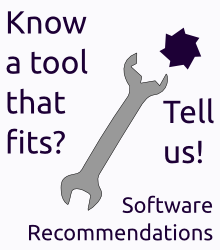
Rough draft, can use some work. But still, a possible start.

3
  • 3
    The "?" sign looks strange...
    – user111
    Commented May 31, 2014 at 1:07
  • Could you please post the SVG, or tell us where you found the shape? Thanks!
    – Nicolas Raoul Mod
    Commented May 31, 2014 at 11:12
  • @Nicolas No svg, but I can post an xcf. As for the shape... I made it by hand :D
    – user46
    Commented May 31, 2014 at 14:07
12

SR.SE invites you to talk about Tools

Wrench and Nut from here.

Somehow this idea looked better in my head.

I'll upload the XCF original if requested.

14
  • 1
    +1 interesting idea! I feel like the colors could be improved but I don't know how... we could ask for help on the chat of graphicdesign.stackexchange.com
    – Nicolas Raoul Mod
    Commented May 28, 2014 at 8:43
  • @NicolasRaoul I'm busy today, if you have the time go forward! Commented May 28, 2014 at 8:44
  • A non-traditional shape would feel better. Commented May 29, 2014 at 8:38
  • @DeerHunter: Do you mean a non-traditional nut (for instance with 5 sides instead of 6)? Or a 6-sides nut and adapted wrench that has a non-traditional wrench shape?
    – Nicolas Raoul Mod
    Commented May 30, 2014 at 6:27
  • A 5-sided nut and a 5-sided wrench. While I'm at it, the wrench could be a bit more elegant. Commented May 30, 2014 at 6:40
  • 3
    @NicolasRaoul - the colors are a bit jarring. The text should be IMHO "Know a tool that fits? Tell us!" - note the lack of ALL capitals. Commented May 30, 2014 at 6:45
  • 2
    @DeerHunter German influence: things you can touch start uppercase (which is why some Germans spell "cat" and "oven" all lowercase, as you can't touch them without getting hurt ;) // Just thinking whether the pic should have our site name mentioned as "caption".
    – Izzy
    Commented May 30, 2014 at 19:57
  • @AngeloNeuschitzer I can't seem to find the SVG for the wrench/nut... did you modify the PNG directly? Or the SVG available somewhere I have failed to find?
    – Nicolas Raoul Mod
    Commented Jun 4, 2014 at 6:54
  • @NicolasRaoul I modified the PNG directly. I don't have or know of an SVG for that file. Commented Jun 4, 2014 at 7:25
  • 1
    I have found an SVG one that might also be used: commons.wikimedia.org/wiki/File:Wrench.svg
    – Nicolas Raoul Mod
    Commented Jun 4, 2014 at 9:19
  • @NicolasRaoul You think we should use the '5 sided nut' idea of Deer Hunter? Commented Jun 4, 2014 at 9:49
  • @AngeloNeuschitzer: Yes, or any even more unusual shape :-)
    – Nicolas Raoul Mod
    Commented Jun 4, 2014 at 10:15
  • 1
    Also, personally I would show the nut laying besides the wrench. That requires crazy 3D skills though... maybe there's an app for this? haha
    – Nicolas Raoul Mod
    Commented Jun 4, 2014 at 10:18
  • 1
    I modified this image and made the image at meta.softwarerecs.stackexchange.com/a/873/140 (and other variations, please choose the best one). Does it look OK?
    – Nicolas Raoul Mod
    Commented Jun 6, 2014 at 2:44
6

enter image description here

4
  • I like that, but I think it would be better in color like Angelo's. Commented Jun 6, 2014 at 11:55
  • 1
    @Gilles: About Angelo's design someone said "the colors are a bit jarring", that's why I changed them. What colors would you like? Red for the nut, for "that fits" and for "Tell us!"? Blue for the wrench? White background? Any other color scheme?
    – Nicolas Raoul Mod
    Commented Jun 9, 2014 at 6:20
  • I like the odd shape. The ad is good as it stands. If you want to improve on it, I would prefer a bigger wrench and Red for nut and "Tell us!" - Also maybe highlight "that fits". Commented Jun 11, 2014 at 7:46
  • Same color for wrench and "Tell us!" is a good idea indeed. I experimented with a bigger wrench but it is hard to fit without becoming too squeezed.
    – Nicolas Raoul Mod
    Commented Jun 11, 2014 at 7:52
3

enter image description here

4
  • 2
    I'd prefer "tool" over "app" as the latter somehow stuck to mobile devices and we are so much more than that. Tailored to SU "Tool" would maybe fit best. Commented May 28, 2014 at 8:40
  • 2
    Indeed app sounds like mobile for many people. But maybe "tool" sounds like DIY/home improvement? How about just "Need software?"?
    – Nicolas Raoul Mod
    Commented May 28, 2014 at 8:42
  • 1
    Thats a great Idea! To the point and exactly what we are here for. Commented May 28, 2014 at 8:43
  • One problem I can see is that it does not try to attract those people who will answer questions.
    – einpoklum
    Commented Mar 22, 2016 at 10:46
3

enter image description here

3
  • 1
    What's the difference between this one and one of your other answers?
    – user46
    Commented Jun 8, 2014 at 23:51
  • 1
    @Undo: It does not have the "Tell us!" part. I personally prefer this one, it feels more pleasant visually. But Angelo's original had the "Tell us!" so I made 2 versions.
    – Nicolas Raoul Mod
    Commented Jun 9, 2014 at 2:58
  • For reference, this was submitted (and both times accepted) in 2014 and in 2015.
    – unor
    Commented Oct 10, 2015 at 22:42
0

enter image description here

-4

enter image description here

(SVG source)

15
  • 6
    I don't like that the ad implies we are a "shopping recommendation" site. We recommend software for a task, not a shopping list builder.
    – Braiam
    Commented May 26, 2014 at 15:50
  • 2
    @Braiam: Thanks for your feedback! For SuperUser people, what you describe sounds exactly like shopping. Even though "shopping" might not capture all the exact spirit of SofwareRecommendations, it is probably the most powerful word to get the idea across. Other designs are very welcome, by the way :-)
    – Nicolas Raoul Mod
    Commented May 26, 2014 at 16:03
  • 2
    I like it, as it doesn't sound too serious.
    – VicAche
    Commented May 27, 2014 at 15:12
  • 1
    I like it too, personally I feel that I'm doing shopping here :) Commented May 27, 2014 at 22:07
  • 1
    Maybe change the string "Shopping?" to "Need an app?" Commented May 28, 2014 at 3:11
  • @unforgettableid: That's an idea! I added as another answer. Everyone, don't hesitate to create different ads too.
    – Nicolas Raoul Mod
    Commented May 28, 2014 at 3:25
  • 1
    I think that the word "shopping" has a great impact because all StackExchange people have been trained to hate this word. It will catch the attention of people, and make them curious about what the site is, which will lead them to participate if they are interested in the concept.
    – Nicolas Raoul Mod
    Commented May 28, 2014 at 3:27
  • @NicolasRaoul I think that last comment of yours nailed it. +1 - Even more so as we can set an ALT Text like "You ain't like that here anyway." Commented May 28, 2014 at 8:46
  • 1
    I think "shopping" raises wrong expectations: people will come over start asking for hardware recommendations of all kind, and then cry if their questions get closed, pointing at our ad. To put it into one of our VTC reasons: "too broad".
    – Izzy
    Commented May 30, 2014 at 19:52
  • @Izzy But advertising is inaccurate at best and misleading most of the time anyway. See my image: If you ask about the best wrench-set you will be closed here as well. Commented Jun 4, 2014 at 7:27
  • @AngeloNeuschitzer Sorry, but that's no argument to me. With that you could even justify advertising "come here, we answer ALL your questions". Just because something is used misleadingly in other areas doesn't mean we should use it that way. Better save us those headaches.
    – Izzy
    Commented Jun 4, 2014 at 7:35
  • @Izzy So then we have to reduce it to "software" and have a link to what we don't consider software (like websites?) besides it. (Your reasoning excludes "Tools" and "Apps" as well) I say let the hardware questions come, they will go away quickly again as well. - I can see your point I just disagree with it. Commented Jun 4, 2014 at 7:40
  • "If two business people always share the same opinion, one of them is expendable" :) Sure. But "Shopping" is definitely out of question (personally, I even feel the shopping cart clipart is already pointing at that too strongly). Shopping questions are off-topic on almost every SE site. Sure it will catch attention just because of that, but to me that degrades us to "boulevard niveau" ("We need strong headlines, no matter what" type). Well, that's my personal opinion ;)
    – Izzy
    Commented Jun 4, 2014 at 9:14
  • "We need strong headlines, no matter what" ← Yes :-) Shopping questions is what SR is for (software shopping questions with enough requirements, that is)
    – Nicolas Raoul Mod
    Commented Jun 4, 2014 at 9:26
  • 1
    If the image indicated clearly that it's shopping for software, maybe it would be more appropriate.
    – einpoklum
    Commented Mar 22, 2016 at 10:40

You must log in to answer this question.

Not the answer you're looking for? Browse other questions tagged .